02 Castle Biosciences
- My role: Senior Art Director
- Team: VP, Creative Services; VP, Digital Solutions; Front-End Developer; Back-End Developer; Project Manager; Client Services Lead; Senior Content Strategist; Senior Motion Designer
- Audience: Providers, potential investors, patients
- Platform: Marketing site on Pimcore with 10+ templates and 20+ reusable content bricks
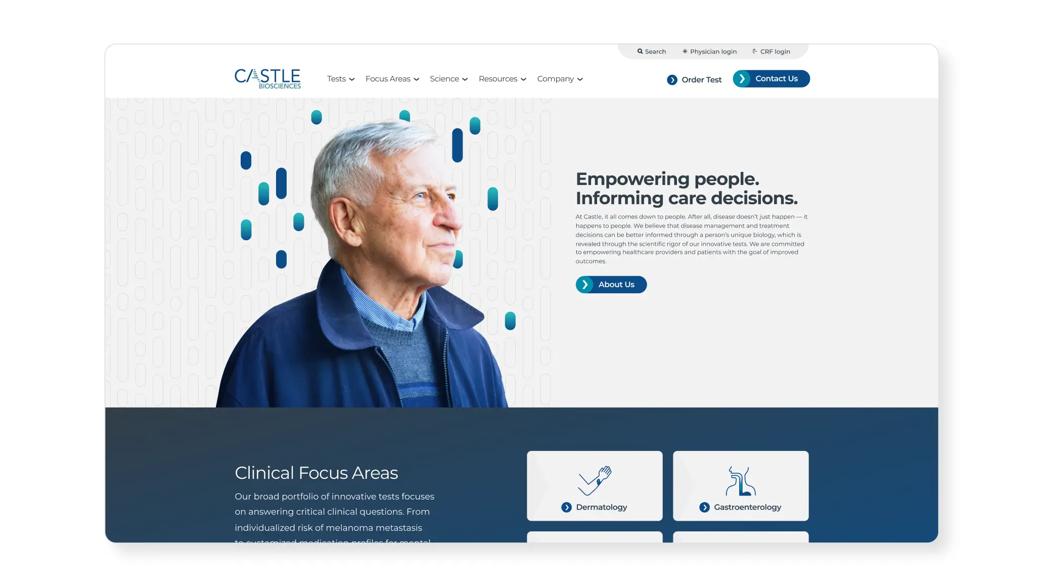
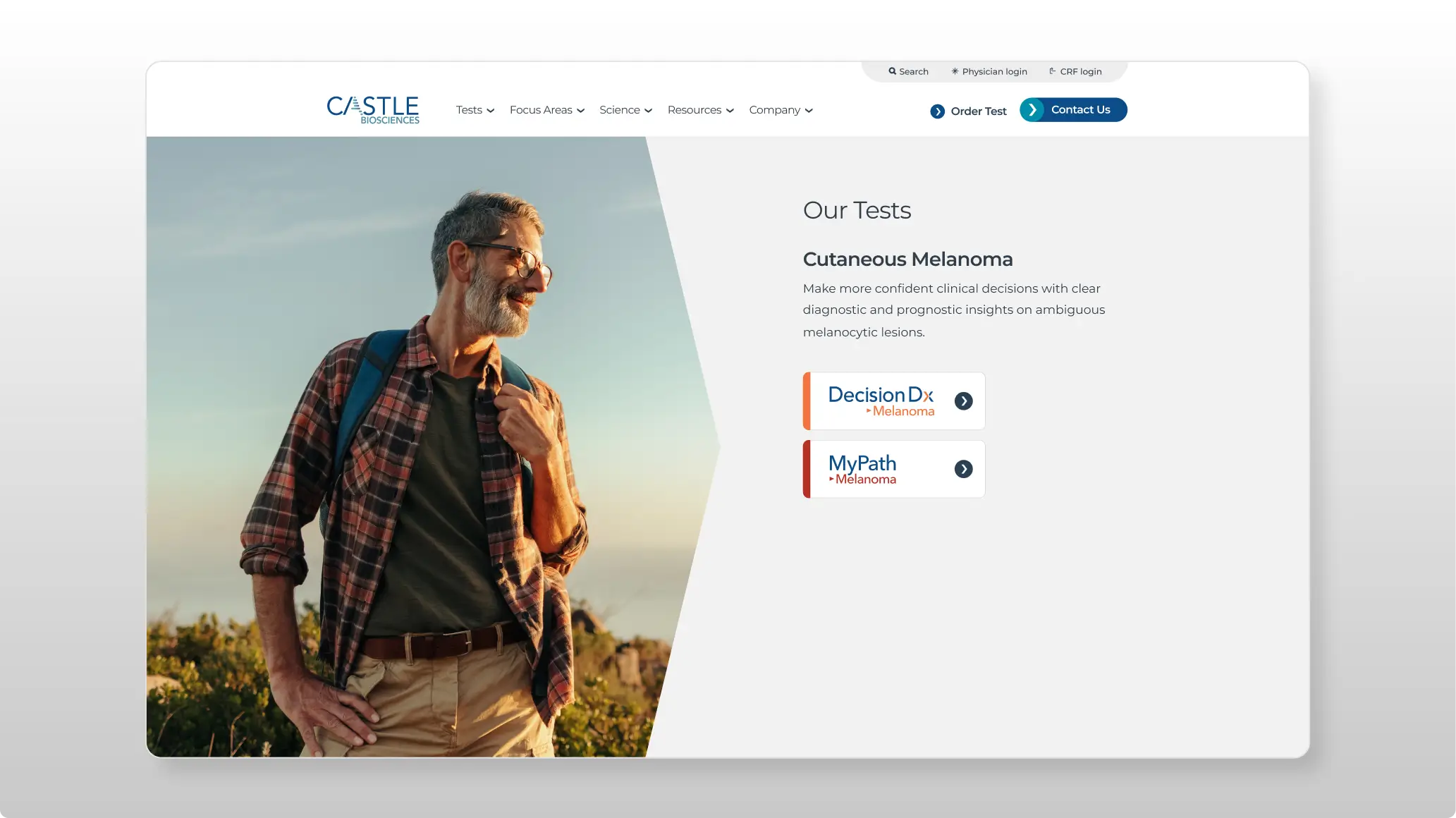
Problem: Castle Biosciences, a fast-growing molecular diagnostics company, needed a brand and website refresh to match its momentum. The goal was one consistent experience across a growing portfolio of specialized tests. The site serves three main audiences: providers who order tests, investors evaluating the company, and patients trying to understand their options.
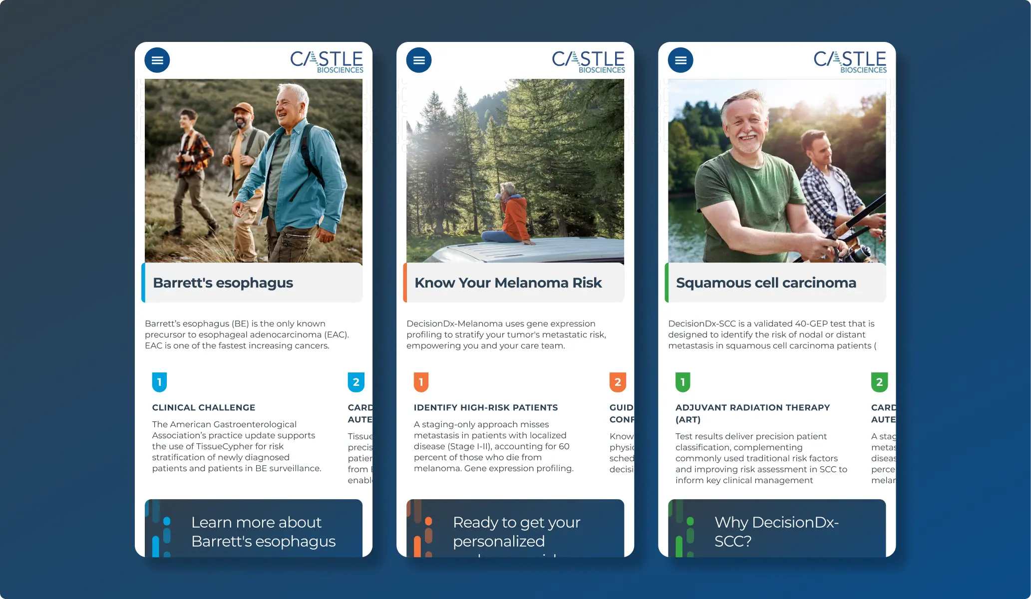
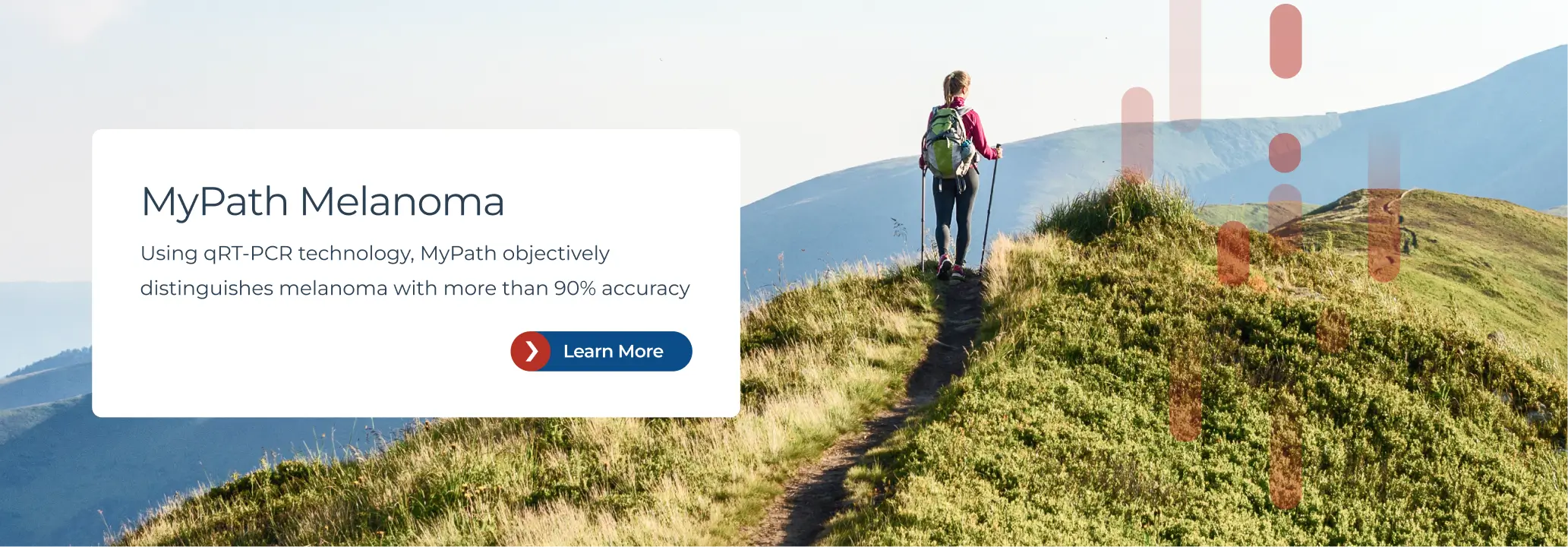
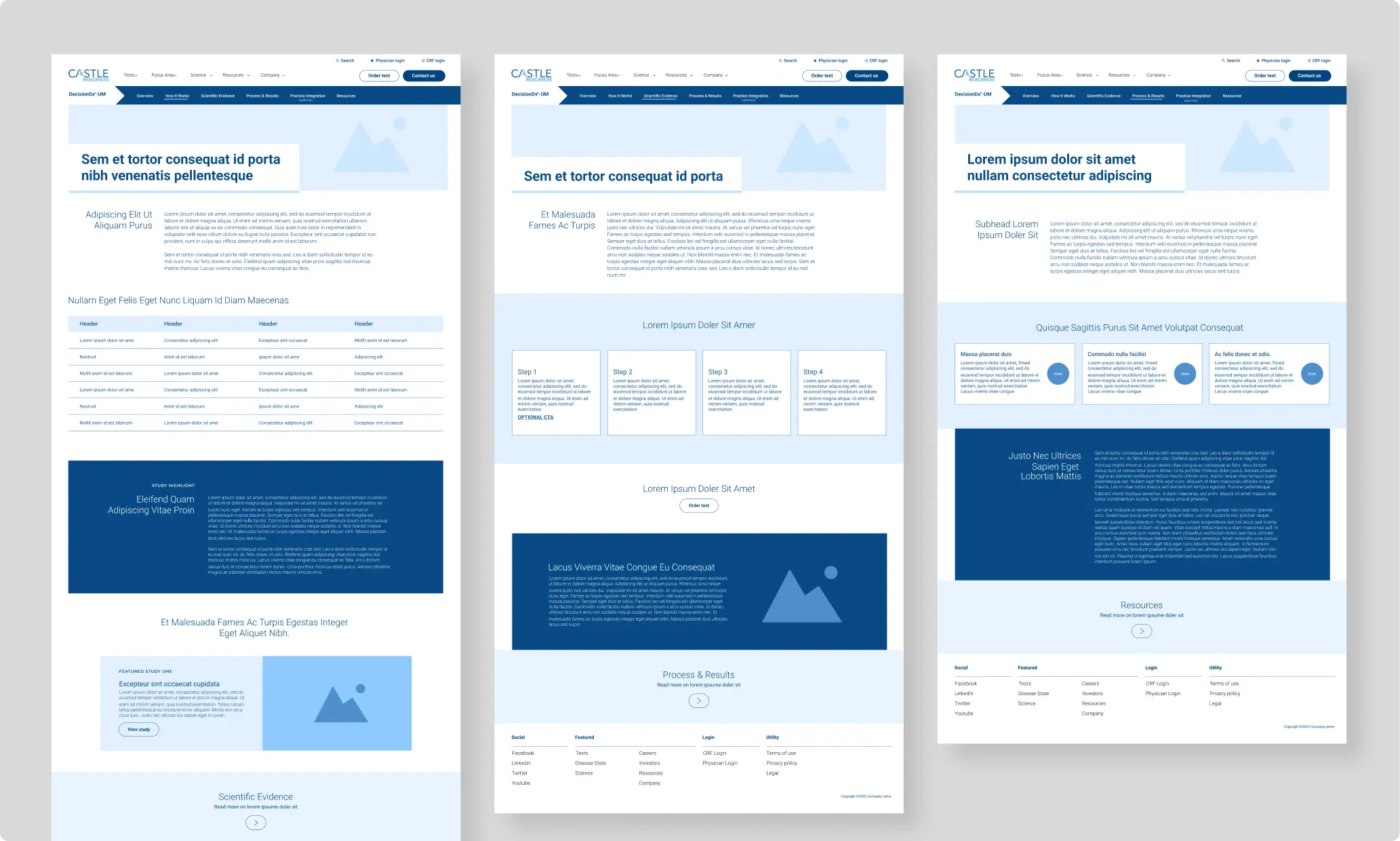
Solution: Building on Castle's existing logos and color palette, I designed a system of templates, components, and image treatments shared across the entire site, including each test sub-brand. A unifying palette ties everything together, while an accent color assigned to each test makes it clear where you've landed. Navigation, page structure, and the content brick library stay the same throughout, so the experience feels consistent no matter which test someone is viewing. The biggest challenge was designing components that use accent colors on non-text elements only, since not every color had enough contrast to keep text readable.
Result: Since the redesign launched, the company has continued to add tests to its product line using the same system.