04 Naveris
- My role: Digital Design Lead
- Team: Digital Designer, Project Manager, Client Services Lead
- Audience: Patients taking the NavDx test, many of them older
- Platform: Patient portal application
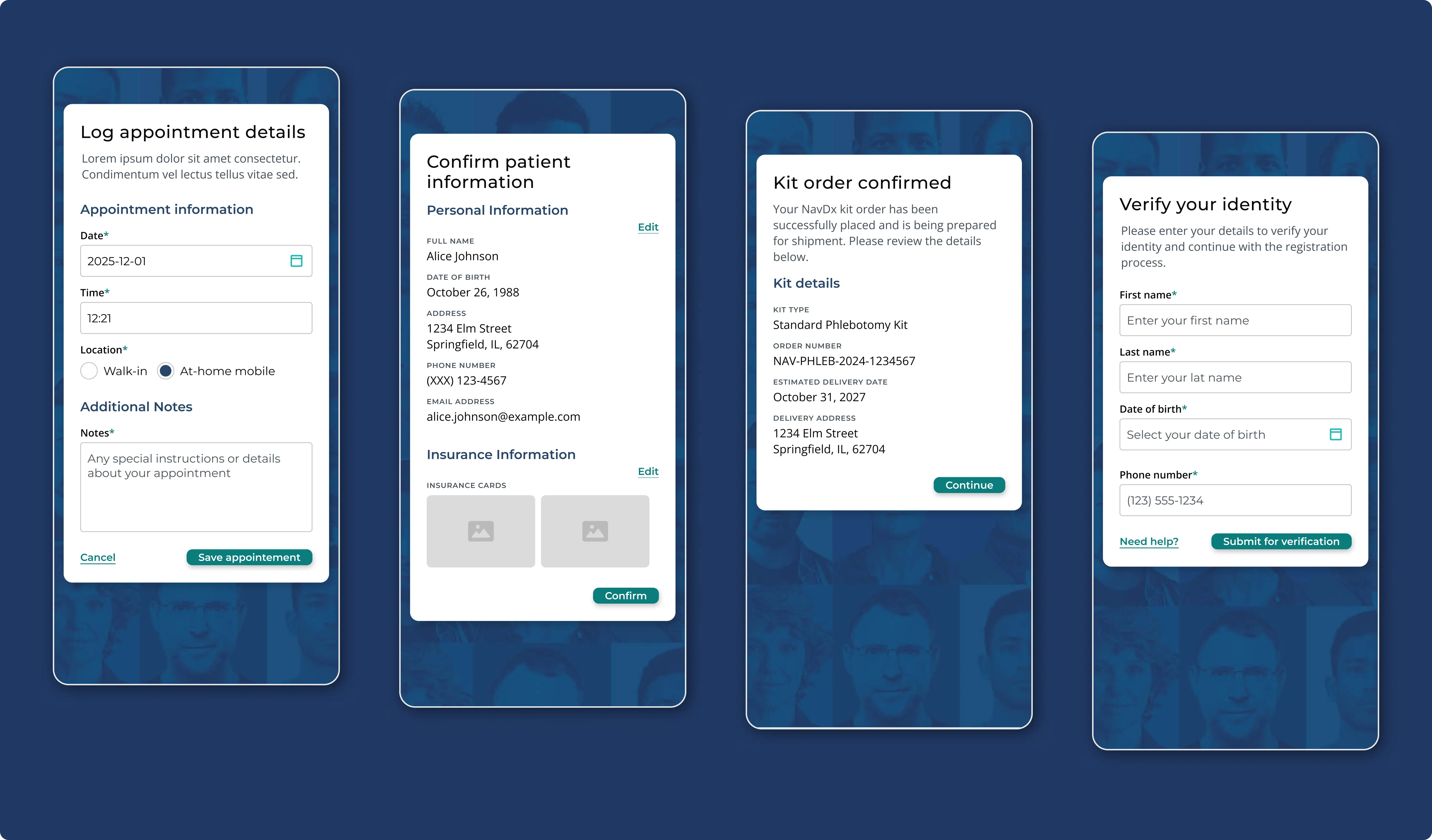
Problem: Naveris had AI-built desktop wireframes for its NavDx patient portal and needed a partner to sharpen the UX and design the UI. Patients, many of them older, would use the app to track their testing results, so it had to feel calm and clear whichever way the news went. With no digital system in place, the look and feel I created would also be the brand’s first digital touchpoint.
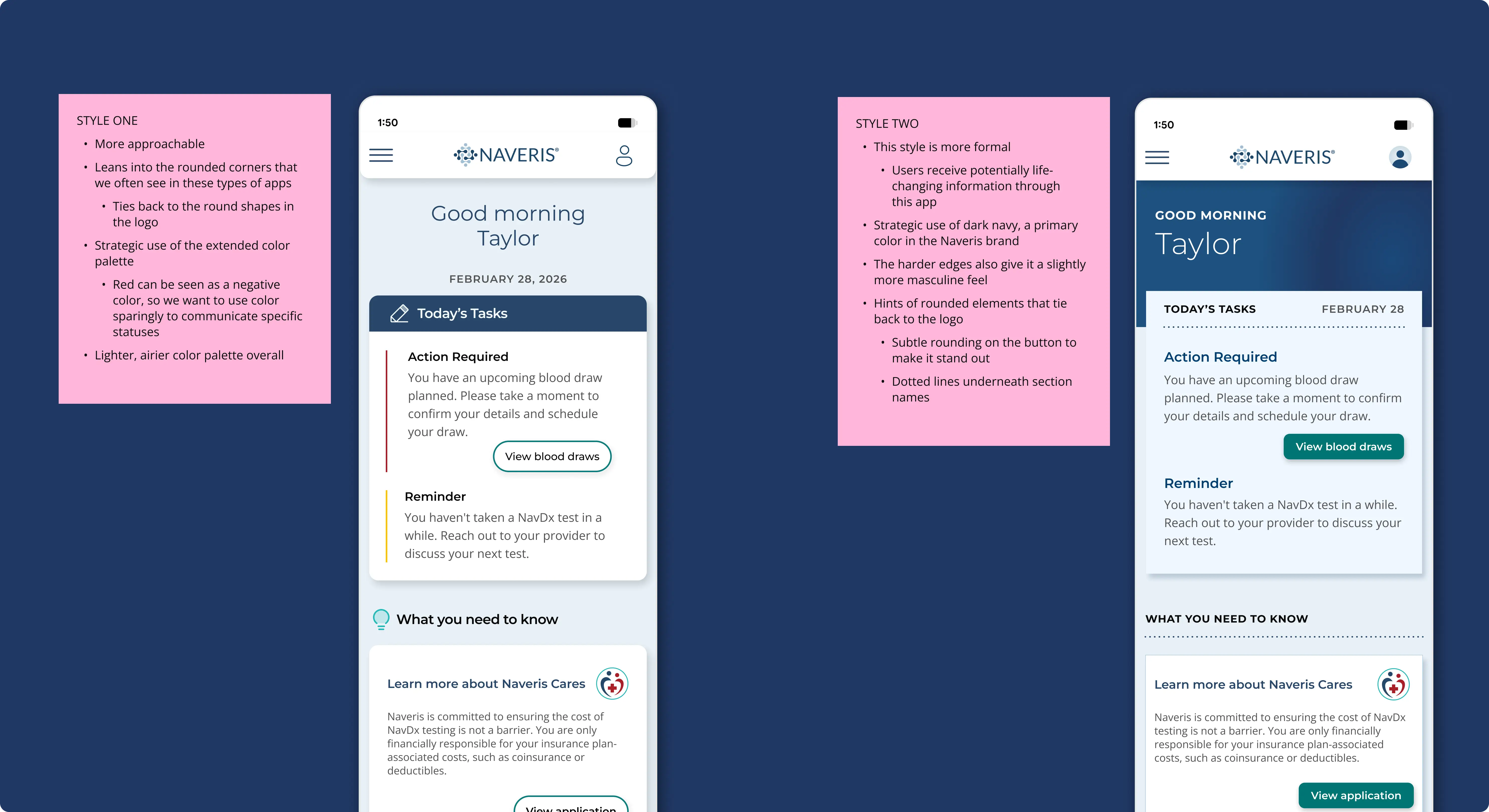
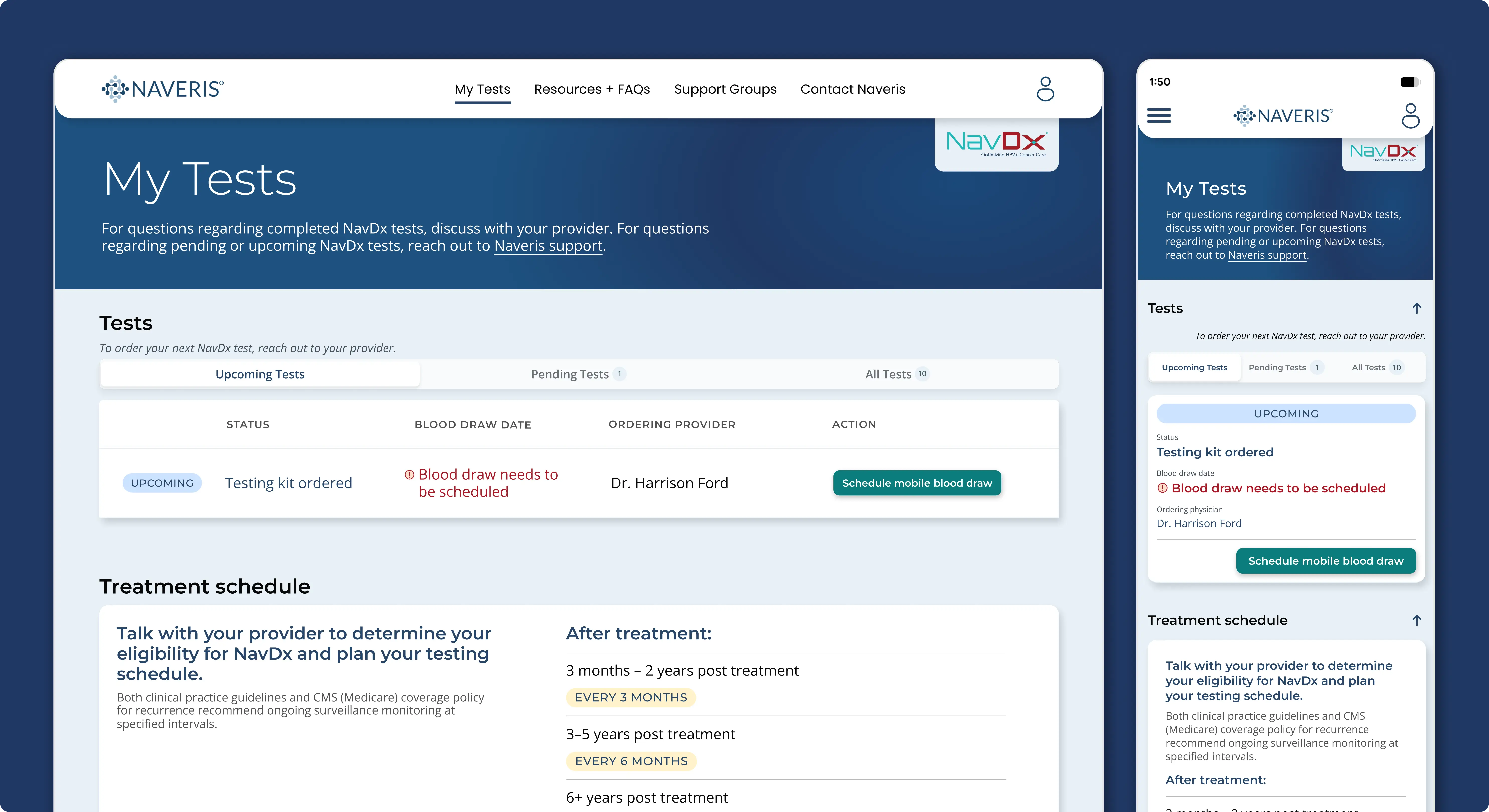
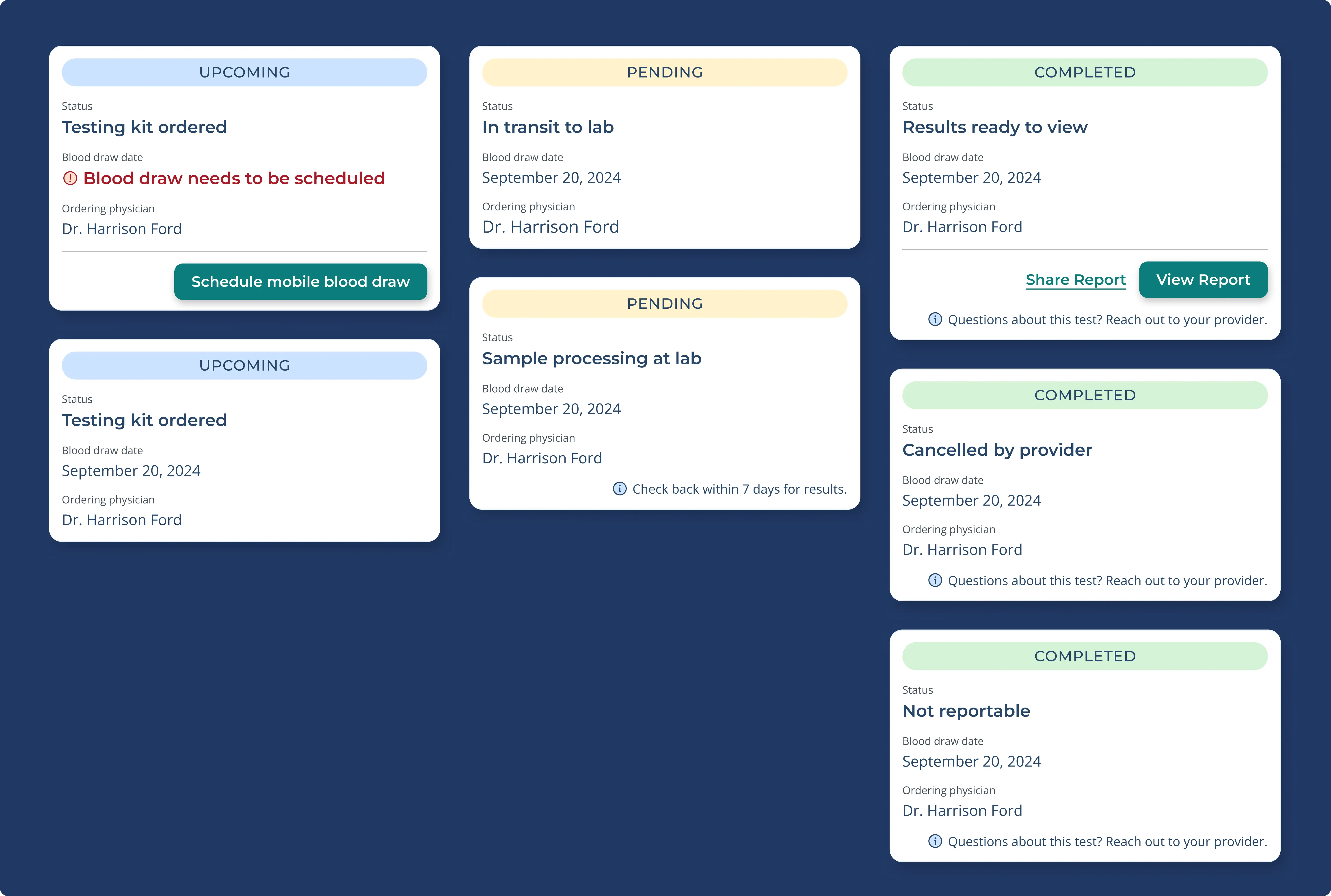
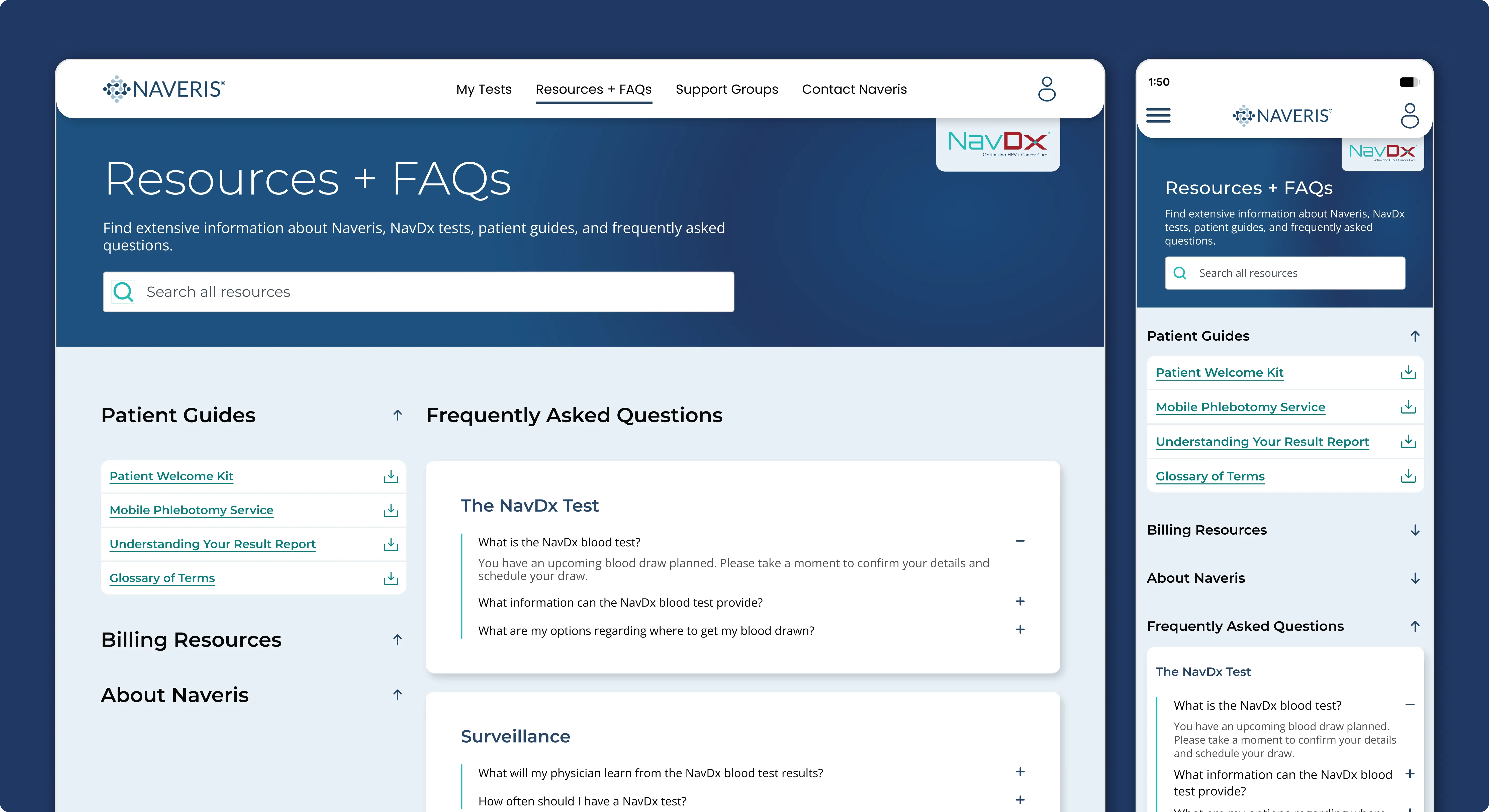
Solution: I started by analyzing patient-facing apps to see which patterns an older audience already knows. I then designed two distinct directions within the Naveris palette: one approachable, with rounded corners that echo the logo and a lighter, airier feel, and one more formal, anchored in dark navy with sharper edges and dotted dividers. Both organize every page so patients can find what to do at a glance, and red and yellow appear only as thin accents, so action items stand out without causing alarm.
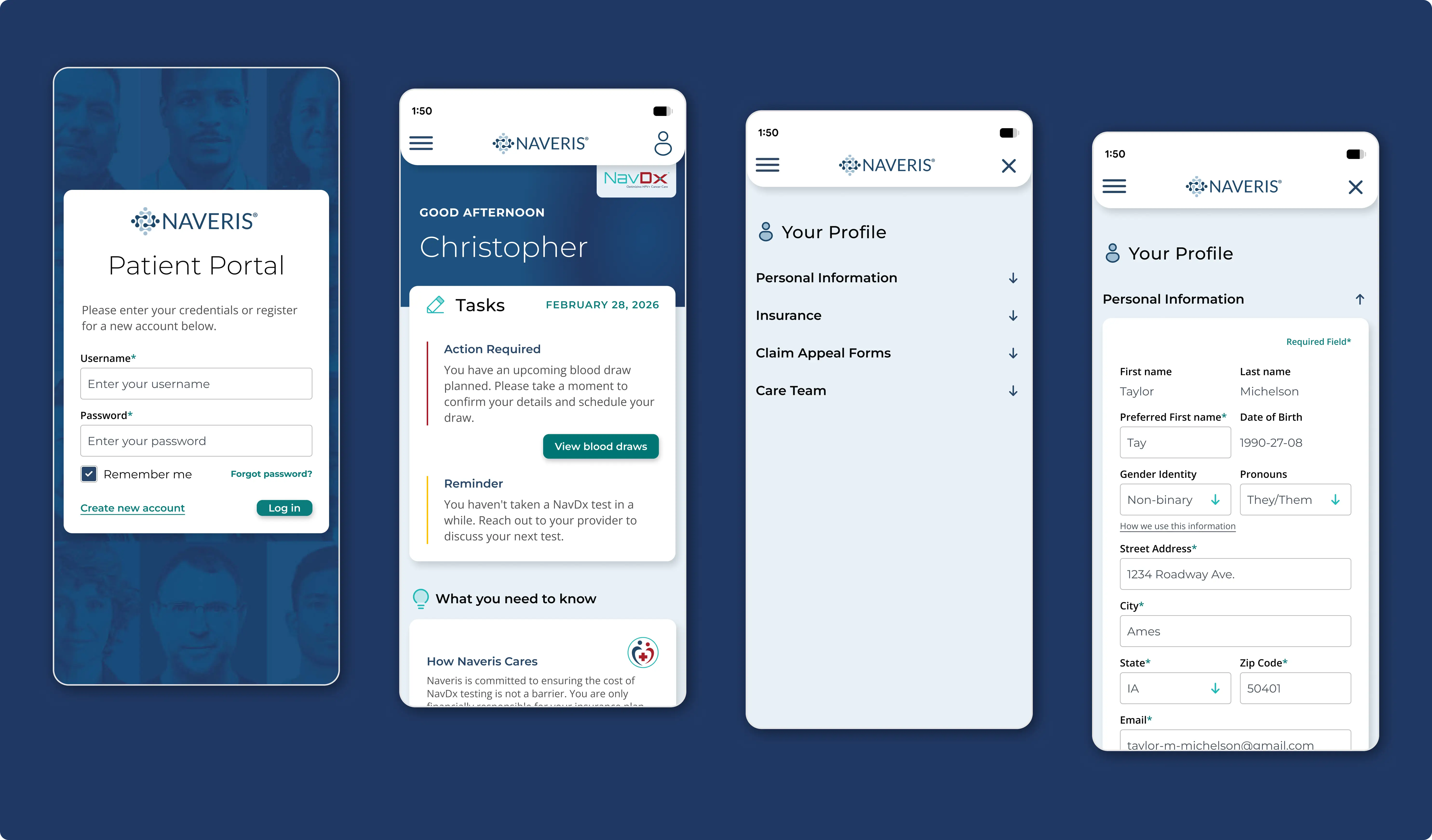
Result: Naveris combined elements of both directions into the final design. It was handed off to the client’s development team, and Naveris came back to us for more work after the success of the project.